Case Background
Renting an apartment online is often a fragmented experience. Users jump between apps and websites that present inconsistent layouts, outdated pricing, and confusing navigation. Apartment seekers frequently struggle to find accurate, up-to-date listings while managing multiple contacts and application forms.
This case study explores a streamlined, mobile-first design that brings together discovery, details, and application into one cohesive experience — reducing friction and helping renters feel informed and in control.
Design Intent
- Enable fast discovery: Simplify search and filters to surface results quickly.
- Build confidence: Present transparent pricing and clear apartment information.
- Guide users naturally: Keep “Apply” and “Contact” accessible without clutter.
- Maintain consistency: Establish a unified visual rhythm across listing and detail views.
Who We Designed For
Jordan Lee • 27 • Minneapolis, MN
Marketing Specialist moving closer to work downtown. Jordan values clear information and time-saving tools when searching for an apartment.
- Needs: Accurate pricing, quick comparison, and fast application flow.
- Frustrations: Repetitive data entry, unclear listings, and hidden contact details.
- Success: Submit an application in minutes without feeling lost or overwhelmed.
Diverge → Converge
Diverge
- Explored multiple layouts: map-first vs. list-first discovery.
- Considered bottom tab vs. slide-out menu for navigation.
- Tested detail-page emphasis between photos and text content.
Converge
- Selected an animated drawer menu for quick access to Saved and Applications.
- Adopted visual hierarchy using generous spacing and muted color contrast.
- Streamlined “Apply” and “Contact” actions for accessibility throughout the flow.
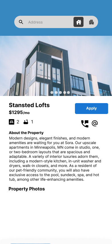
Proposed Experience
The final concept centers on simplicity, flow, and familiarity. Users can search for apartments, view listings, and apply without leaving the main context. Motion is subtle and purposeful — guiding transitions without distraction.
- Search & Discover: A concise search bar with toggles for property type.
- Listing Detail: Immediate visibility of rent, photos, amenities, and map.
- Apply: Progressive disclosure through short, clear sections.